By Fred Saunders, Vice President, Brand & Social Impact
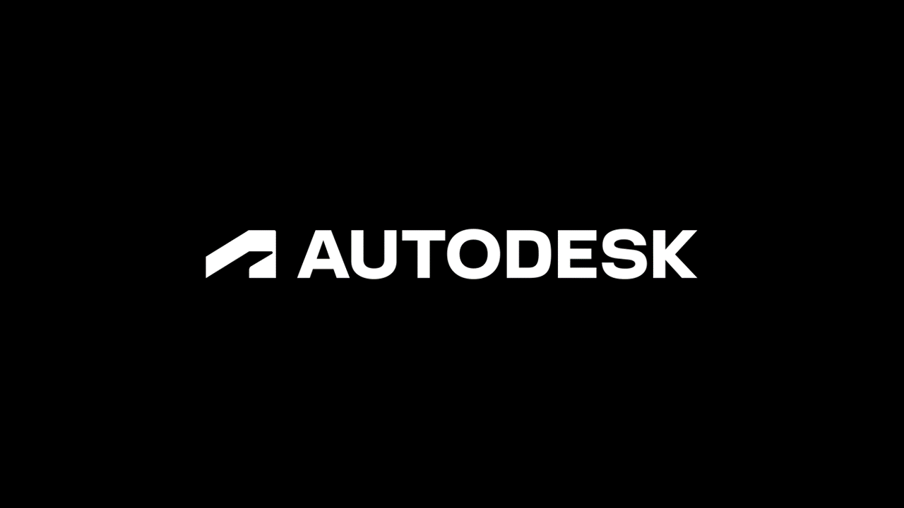
Today we’re excited to introduce a new look and feel for Autodesk, including a new logo, colors, and imagery. This change is the first of several bold moves we’re making as a company to reimagine the Autodesk brand—one that underscores our belief that a better world can be designed and made for all.
Dynamic, modern, and memorable, the new Autodesk logo represents action, momentum, and a clear direction toward the future. It’s a strong, simple logo that illustrates a brand synonymous with doing.

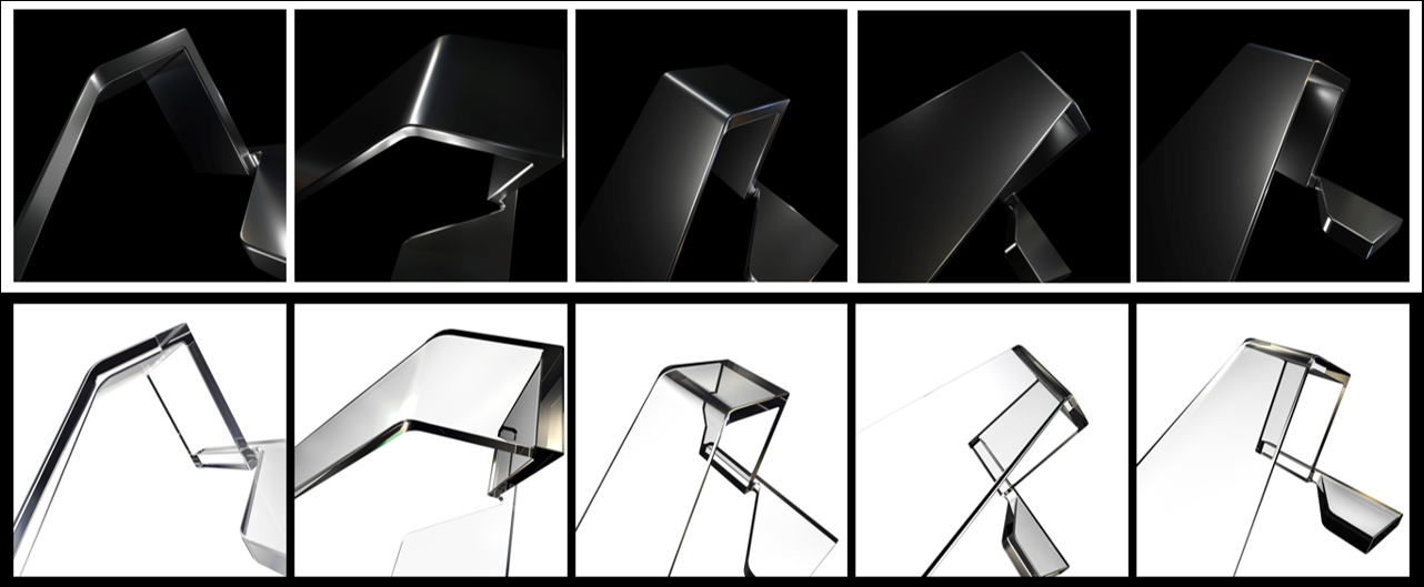
Our new brand imagery features abstract 3D geometric forms created by focusing on parts of the symbol in the new logo.

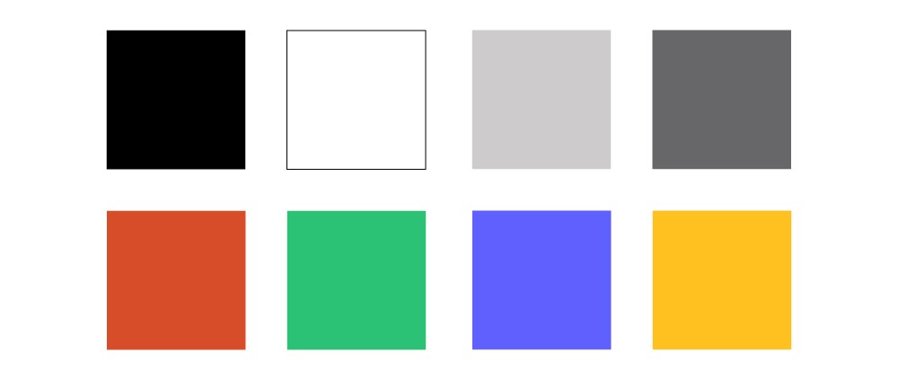
In addition to the new logo, we’ve made changes to our brand colors. While the Autodesk blue represented us well for many years, it is being updated with clean and contemporary primary colors of black and white. Alongside these two primary colors, we are introducing two detail grays, and four accent colors–clay, plant, iris and gold.

We’re looking forward to sharing additional elements of our reimagined brand in the future. This will include new product identities and icons that will help to visually differentiate our range of products across industries and make our icons more easily distinguishable. Stay tuned.