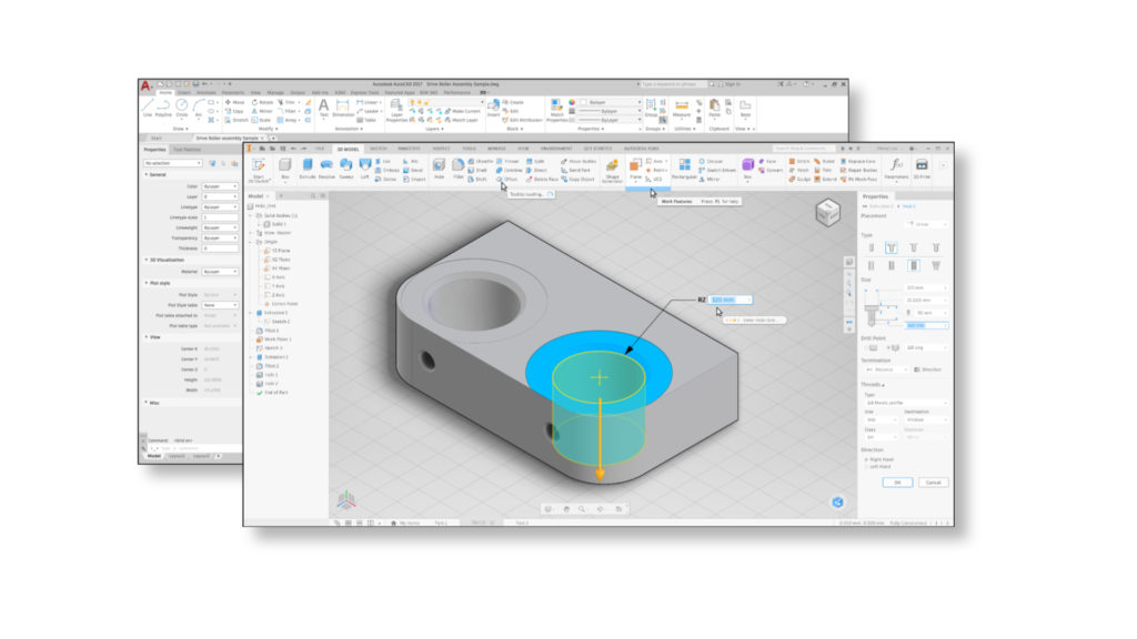
By now you have likely seen what’ s new in Inventor 2020 and the Product Design & Manufacturing Collection. When you launch Inventor 2020 for the first time, you see the new modern icons (over 7,000) and the new lighter theme that looks very similar to AutoCAD and other Autodesk products, but there is much more than that going on under the hood.
Much of what you see in the product today started several years ago when we kicked off our modernization research efforts. The goal was primarily around making Inventor faster and more intuitive to use as well as having a much more cohesive experience between Autodesk Products such as AutoCAD

Beyond the new icons and cohesive experience, you will quickly notice several enhancements from better multi-monitor support, new Property Panel for Extrude, Revolve, Sweep, Thread & Frame Generator, sketch loop/profile detection and much more.
Why make these changes you ask?
In 2015 we started surveying and interviewing hundreds of customers to first understand who they were and secondly what they liked and didn’t like in Inventor. Of those surveyed, we found that a vast majority have been using Inventor for more than 5 years, used multiple monitors, preferred standard dialog boxes to the mini toolbar and liked the ribbon experience in Inventor vs. other UI experiences on the market to name a few.
At various events such as Autodesk University, we hosted researching sessions to learn how many of you use Inventor. We ran studies with eye-tracking technology to understand the flow through the product and to find bottlenecks and workflows that might cause confusion. The image below is what a typical eye tracking plot looked like when we asked customers to accomplish a simple task in previous versions of Inventor. You will notice there isn’t much of a flow through the command and even looks a bit frenetic.
![]()
Taking what we learned, we built prototypes of the new property panel and tested them with customers, gathered feedback, made changes and retested new prototypes. This went on for some time until we had refined the experience and customers said they liked the way they flowed through the process. We were also able to validate this with eye tracking, notice the natural flow from top to bottom as customers tested the new workflows.
![]()
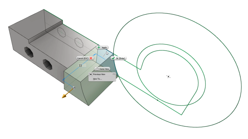
We didn’t just stop at the Property Panel. In looking at Sketch workflows, we saw many of you going through extra steps when creating sketches for features like extrude, revolve, sweep & loft features. To make sketching more intuitive and faster, we introduced sketch profile/loop detection that lets you select loop/profiles without having to do a bunch of trimming.

You will find a host of other areas in the product we worked on to make it faster, more intuitive and a fresher look. We couldn’t have (and wouldn’t have) made these changes without all the help from the community. As mentioned, we have interreacted with countless customers at events, in our offices, at your offices, idea station & forum posts and analytics we capture from regular product usage. So with that, a huge thank you to all of you that have helped out over the last few years in making Inventor better!!
In closing here is a short video to show these changes in action!!
Learn more about each of the features added on the Inventor what’s new page and plan your software update.
Email – garin.gardiner@autodesk.com
Twitter – @garingardiner

Garin Gardiner Is a Sr. Product Manager for the Inventor product line at Autodesk. Garin joined Autodesk in 2005 and has worked in QA, product management and business development. Prior to joining Autodesk he designed roller coasters and worked for an Autodesk reseller. In his current role, he manages the nesting utility and the modernization for Inventor.


