How does an electric vehicle (EV) start-up break into a market that’s both risky and necessary—when only one company has achieved real and sustained success? This is the question that Lucid asks and answers.
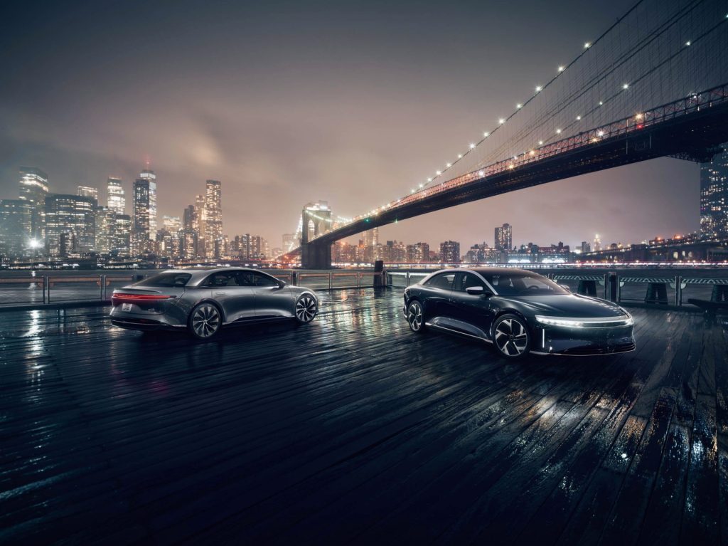
As its first sedan model, the Lucid Air, begins production and looks forward to launch, we’re seeing a new approach to EVs: a philosophy that balances the latest technology with the heart of design in a brand that incorporates the best qualities of both tradition and innovation.

It starts with vision
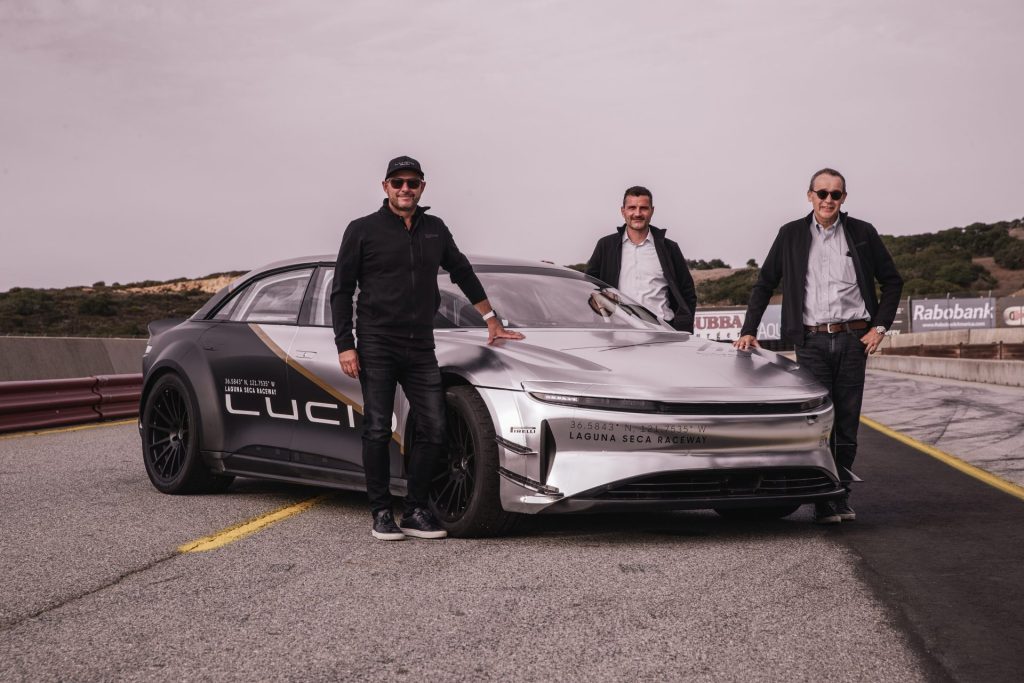
Lucid’s philosophy has been honed under the experienced hands of SVP of Design, Derek Jenkins. Having worked at a number of major OEMs throughout his career (including Audi, Volkswagen, and Mazda), Jenkins hit the 20-year mark in his career and wanted to achieve something more, something different. He’d seen friends work with Tesla from the ground up, realizing unprecedented success with EVs.
Then Jenkins met Peter Rawlinson, Lucid’s CEO and CTO. The company was in its infancy and, as Jenkins recalls, the two “really hit it off in terms of technology, what was happening in the automotive space—both from an electric standpoint as well as a connected car standpoint.” That serendipitous meeting inspired Jenkins to make the leap from more traditional car design.

When Jenkins joined Atieva (as it was then called), they were a small, scrappy 80-person company. James Searle, Lucid’s Digital Design Manager, notes that the team was built with tremendously experienced individuals transitioning to an EV start-up for the first time, together. Many of them brought a history of pouring passion into vehicles that never saw daylight.
Jenkins knew that joining an EV start-up meant facing significant challenges, instability being one of them. In the past, all but one had failed. As Jenkins weighed potential risks and rewards, he trusted the vision and the team he was about to join.
For James Searle, the moment seemed right. He remembers thinking, “Is this finally the time where people start to think beyond their daily inclination to drive and more about the impact they’re having on the environment?” He began to look around at various EV start-ups, and then he heard about Jenkins’s move. Having worked with Jenkins at VW and seeing first-hand the engineering strength at Atieva, he wanted in.

In 2015, the team had a vision for the car it wanted to create but hadn’t yet established their market position. The need to differentiate themselves both from traditional vehicles and from other EVs meant prioritizing experience: creating a delicate balance of new technology, efficiency, and performance that they could merge into a brand for the luxury market.

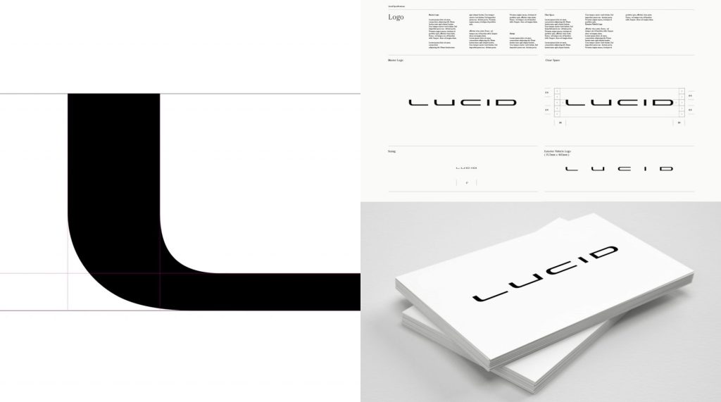
They started developing their first model between 2015 and 2016, in what Jenkins calls the “alpha stage proof of concept,” which coincided with rebranding the company. This is where Jenkins’ design philosophy sets itself apart. Aware of a shift away from heritage, legacy, and opulence, Jenkins and his team moved toward technology, efficiency, and experience. “Lucid” reflects their positioning and vision.
One of the benefits to start-up work is the flexibility and freedom to do things differently. Searle remarks on the impact a digital modeler has within a company like this, working directly with engineers to solve problems. Traditional OEMs tend toward clearly defined roles in a clearly defined process, but Lucid works differently: here, collaboration is key. It’s not uncommon for the design team to pull in members of the marketing, branding, and sales teams to get feedback and insight.
Peter Rawlinson has earned a reputation for being as passionate about the company as the product and being willing to make hard decisions. Whether that’s last-minute changes or a complete rebrand, he believes that it must be right. And he’s willing to spend the time to get there.
It deepens with design
The shift from Atieva to Lucid was daunting. That name signified a business-to-business brand, acknowledging the necessary technology support the company needed—but Jenkins knew that what would win hearts and minds was more consumer facing, more aligned with their ethos.
Searle notes that their company aimed to approach the idea of an EV differently. Most EV companies simply install electric motors and batteries in traditional cars. But Lucid had a more expansive vision. Essentially, the team took a blank sheet of paper and said, “Given that we are now able to use electric motors and batteries as the power, what does that allow us to do?” The answer: completely repackage the vehicle for space.

But a designer breaking with tradition needs to know their audience and precisely how far they can go with a new look and new language without losing potential customers. The history of design is filled with advanced ideas and pieces of design that were ahead of their time. As good as they are, when they’re not adopted or adapted, they help nobody.
Under Jenkins’ guidance, the team began to build something new. Rather than simply pushing the vehicle further down the road, Lucid asked: is there a better way to design EVs? This question applies to everything from motors to batteries and every part of its design.

The design goal was also to balance being both provocative and meaningful: to get people to sit up and take notice because it’s different, and to still be accessible, offering consumers a way into something they recognize and value. Jenkins knew that Lucid might not sound like a traditional car company, but that it would grow on people.

In the beginning, Jenkins chuckles, “people were like, ‘Oh, that’s terrible.’ And a lot of the engineering teams thought that it should be more futuristic. That’s exactly what I thought it shouldn’t be.” Lucid plays on the difference between a pragmatic, literal description and an emotional, visionary approach.

Accessible and unique, it signals a shift in the EV market. Lucid’s clear vision, luminous quality, and optimism became the common thread, the lens through which the team looks at everything they do. And on the heels of that bold decision, the other branding came naturally: Air for the Lucid sedan, and Gravity for their SUV.

As Lucid navigated both its brand positioning and its EV design, it had to confront time. Searle notes that in the EV market, “This vehicle may have a longer lifecycle than a standard car, so it needs to age well from a from a design perspective.” The benefits of the electric drivetrain also present a design challenge: there’s much more interior volume. Trends have shifted from bulky outlines, so designers aim to create a lower volume model. And luxury designers know: if the vehicle looks like a minivan because it’s essentially a cabin from front to rear, you may have lost your target audience.
Lucid drew on aircraft influence. The Lucid Air is the most aerodynamic luxury car in the world. Collaborating with the aerodynamics team from the initial sketches, they co-developed the design to ensure, in Searle’s words, “that it was aerodynamic without being weird.”

The design team worked with their colleagues who know regulatory compliance, so they could create a better design. That collaboration, the team is proud to note, shows clearly in the end product.
It’s possible with the right tools
Having been in the industry for years, the Lucid team was already familiar with Autodesk products. Searle observes that the team uses Alias every day: for SubD and developing 3D models from 3D concept sketches all the way through to Class-A. Like Lucid, more and more design teams are realizing that Alias can be used as a tool in every stage of production. Recent updates enhance user interaction as well as the behavior and consistency of Alias tools, allowing Lucid to determine details like highlighting and surface patch quality.
For Searle’s team, Alias is a natural fit because “Autodesk has really excelled in offering this solution that allows you to develop a design from sketch to tooling release, all from the same familiar workspace. Perhaps more importantly, it’s often in the hands of the same individuals so that person essentially is able to ensure that the design remains true to itself—that it isn’t polluted by being handed from one person to another on its journey through to production.”
The flexibility and breadth of the Alias workflow increases the benefit to Searle’s team: “we have members of our modeling team who come from a design background, who are basically working directly with suppliers to problem solve. But more than that: we want to ensure that we solve problems in an aesthetically pleasing way. This is fairly unusual in the industry: it always used to be the case that a design would essentially be passed on to a production team and then at that point you kind of lose track of it. You never really had full clarity on what was happening between the design concept model and the production model.”

Lucid’s integrated design approach allows the team to follow the process from the original design right through to the final model signed off for production. Searle elaborates: “I think the production car looks even better than the show car because everyone remains hands-on throughout the entire process. And we can do this because Alias is such a versatile tool.” And while there is a steep learning curve to Alias, Searle tells less-experienced team members that the minute they’ve broken Alias, they no longer worry about how they’re building surface—they can focus entirely on how the design looks because the software has become second nature.

Searle credits Autodesk’s unique approach to laying NURBS surfaces down at the same time, allowing the team to create usable data to be shared with engineering. Before that, Searle notes, “if you built a poly and sent it to engineering, they looked at you like you’re an idiot.”
Jenkins and Searle have used VRED for years. Both rave about the quality of its diagnostic and aesthetic rendering, especially when it first came out. It was a transformative moment in automotive design and a strong sense that this software could forge the path to a seamless virtual experience.
It evolves with the times
The cost of EV technology remains such that the luxury market is Lucid’s necessary starting point. But the goal is not to stay in this market. Experience and design credibility will allow Lucid to democratize the technology for a wider audience. Sustainable vehicles won’t be a solution for the global climate crisis facing the automobile industry if they remain largely inaccessible.

Trust and technology go hand-in-hand for Lucid. In its beginnings, the company invested in VR technology with the goal to incorporate into their daily workflow. That’s when the team started to build up a review routine, which has become their daily practice. Working in VR gives the design team the chance to work through all the data and loops of derivatives.
As VRED has incorporated VR capabilities for design review and collaboration, these have become integral to Lucid’s process. It allows them to hone design without the time and expense of constantly re-milling physical entities—a huge time-saving benefit. In conjunction with Alias’s rapid workflow, the Lucid team can present new model variants in VRED VR every other day. Searle explains: “We’re presenting something on Monday, do changes on Tuesday, look at all the changes on Wednesday, refine more on Thursday, then look at those changes again on Friday. That’s how quickly we’re iterating, because we’re using VR.”
Like many others, Jenkins took a while to acclimatize to VR. For him, it wasn’t about the goggles or the physical sensation, it was about trusting what your eyes see. “There’s a boundary where you’re not sure if what you’re seeing in the VR is the same as what it’s going to look like in real life. Once you get over that boundary and you have that understanding of what the differences are, then you trust what you’re looking at that and it works really well.”
As VR evolves, design teams are able to do more, like scanning in textures for the actual materials. This capability makes VR more realistic, so people are more willing to believe what they’re seeing in VR and stand by it, which has become especially necessary in COVID time.
That trust is crucial for another function of VR: the ability to rapidly review various iterations. We’ve heard this from other clients as well; collaborating in VR means that design teams can scroll through a timeline of a model’s data in real time. This allows teams to return to earlier iterations easily and efficiently.
Lucid has also used VR extensively for showroom design and remodeling their studios and headquarters. Lucid has even gone so far as to bring VR to the retail customer experience. It allows customers to review a model with numerous options—without the need to showcase physical models. Lucid wanted to keep their retail footprint contained, with small studio spaces in high-traffic shopping areas.

As VR technology evolves, Jenkins would love to see infinite, real-time morphing of his design iterations. That data is crucial as designers work through their designs: move the wheelbase around, move the vehicle height around, adjust the styling. “You have to be able to review and analyze your model in real time. Seeing these kinds of changes would be impossible in any kind of clay model, so being able to iterate rapidly in data, in virtual, is the number one thing for me. I would love to have a real-time design database where I can just say, ‘Remember that car from 1997? Yeah. Pull that in, pull this in.’ And it would be there.”
For Searle, the next evolution would be introducing AR into Alias or VRED. It’s of interest especially to those who develop interiors. “Blurring the lines between the digital and physical environments and having the ability to apply your CMF strategies to a blank physical canvas, I think that would have real efficiency benefit, particularly if you were also able to do user testing of UX and UI or some of the basic control functionality.”
Jenkins also hopes for more real-time review tools, so that design teams can drop in notes and marks in 3D. Any kind of tool that can make real-time reviews and modifications more robust will make conversations richer and decisions easier.
As every OEM knows, richer conversations and more informed decisions make for more innovative designs and happier customers. Up next for Lucid: getting the Air to consumers and developing the Gravity (SUV). The Lucid team faces the future with clarity and purpose. In Jenkins’ words, “It’s an exciting time to be Lucid. It’s an exciting time for our industry. The changes that are coming to the automotive industry over the next 10 years are going to be transformative. I’m thrilled that we’re a part of that.”

To learn more about Lucid Motors, check out https://www.lucidmotors.com/stories/.
For more stories like this, swing by our Design Studio Blog for Part 1 of our Project Arrow feature or take a look at our “Stories from the future of making things.”
For updates and the latest news, subscribe to the Autodesk Design Studio blog and our Alias and VRED YouTube channels. You can also follow us on Facebook.